Vtiger Contact page redesign
Vtiger is opensource CRM targeted at small and middle scale businesses. My job is to transform 10 year old contact page into 360o view which shows all essential information at one place and minimize the navigational switching.
What's the problem?
Contact page consists of several fields (nearly 40) that provides details about the contact but that is not helpful for sales and marketing executives. They need more than just plain details, an integrated view, engagements and events, to take quick decisions efficiently.
Challenge
To design a information architecture that provides comprehensive view of the contact (customer) which includes information such as the previous sales enquiries, buying patterns, status, deals, comments, events & activities.
Empathize with users
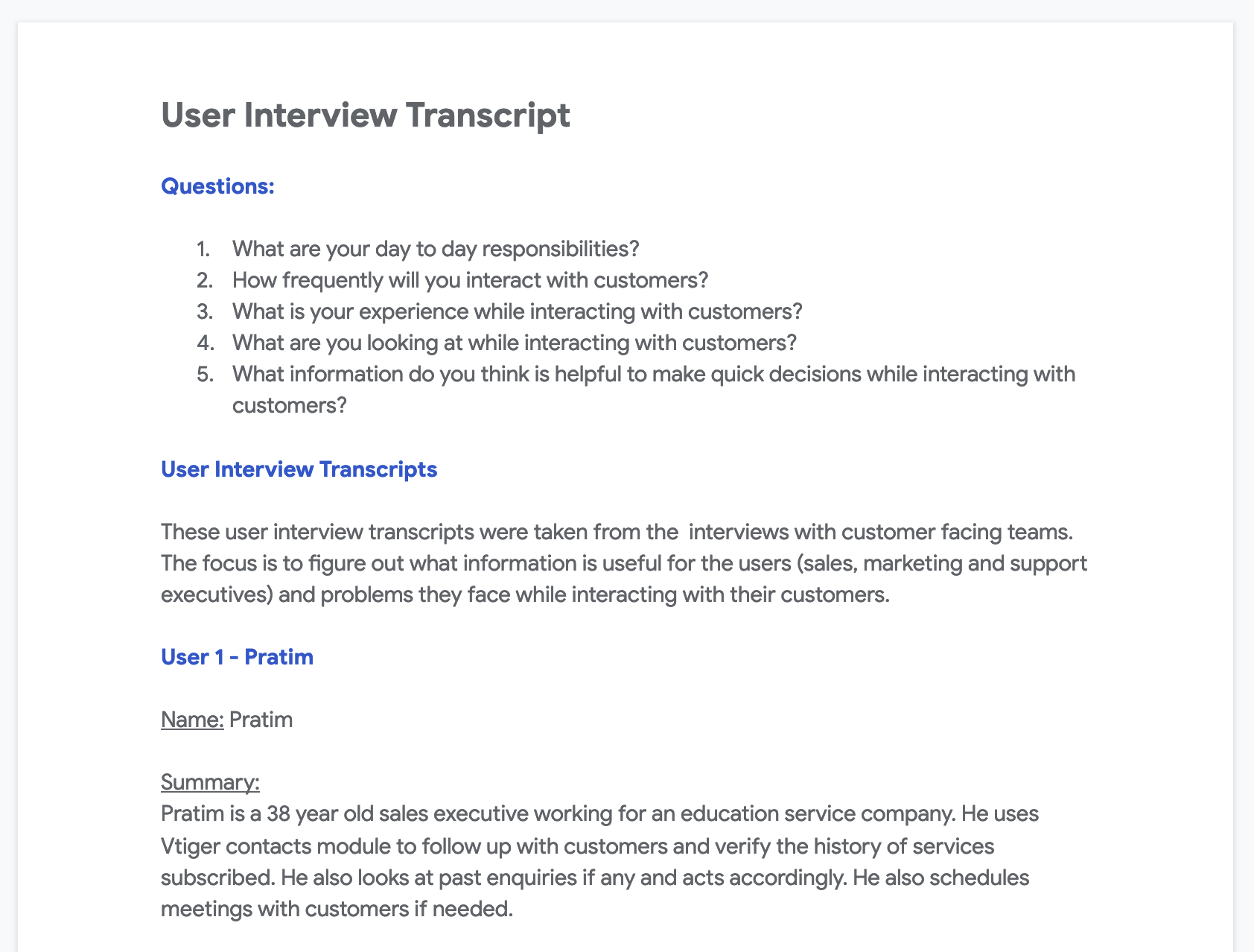
My research goal is to figure out what information is useful for the users (sales, marketing and support executives) and problems they face while interacting with their customers.
I have conducted interviews with some of Vtiger customers and the members of customer facing teams. The interviews questions were:
- What is your experience while interacting with customers?
- What are you looking at while interating with customers?
- What details do you think are useful to make on-spot decisions while interacting with customers?
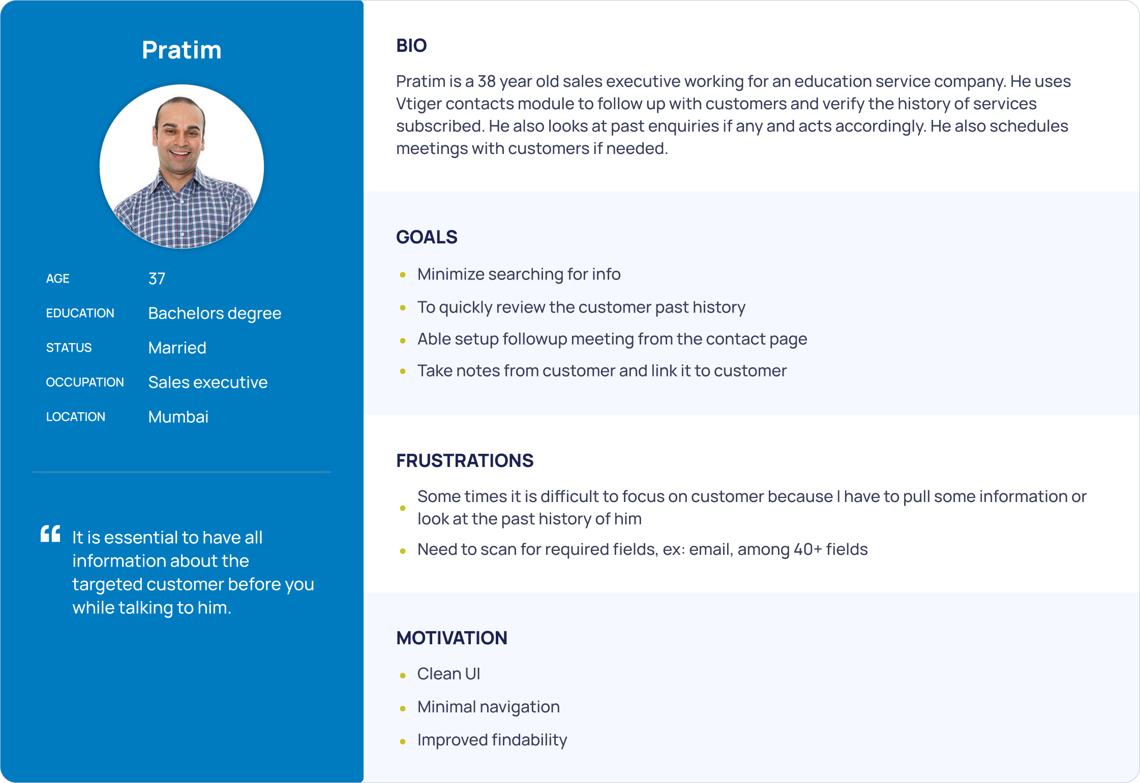
The major observations are below
So much time is wasted while searching for the fields among the ocean of fields.
The data is scattered across the pages. Users has to move between mutiple pages and tabs.
One has to go to Comments tab to view/add comment.
Users has to go to Calendar module to create an event an link it to contact
The Persona that reflects these findings are
Problem definition
After researching, excercise, and identifying the painpoints, I have a cameup with problem statement.
Problem statement
The new contact page should provide a view that highlights the essential information and hide irrelevant data. The page should minimize the clutter by moving the data into tabs which allows Users to access when required. Also provide different ways to interact and update the information.
Value Propositions
- Contact page customization
- Snapshot of the contact
- Recent touchpoints/comments of the contact
Design - Wireframe
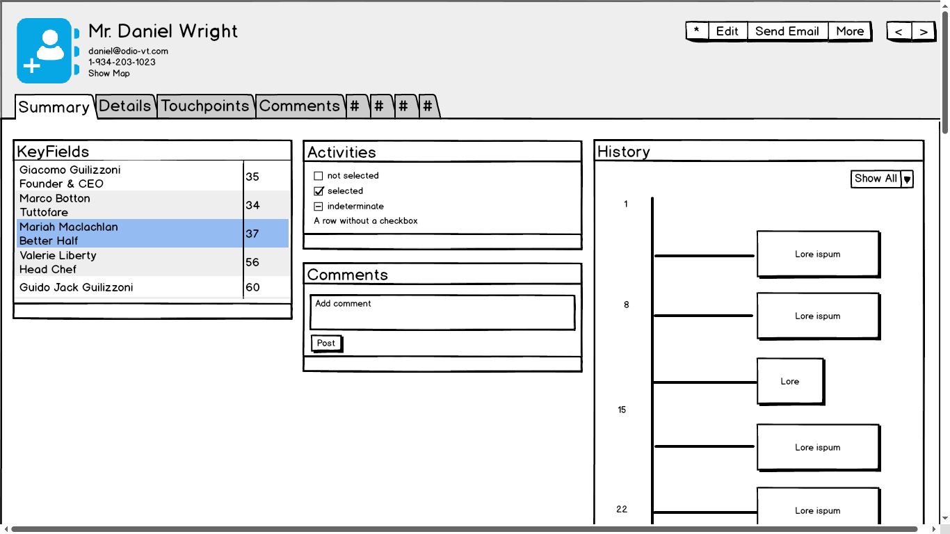
User testing
My aim is to design best information architecture. So, my research questions are simple and focused on finding the given information is useful for the participants. So for each widget I have 2 questions. 1. At what degree the information given is useful for you considering your day to day work. 2. Did you find the information you are looking for? if not what is that? The following are the insights from the User testing
Insight:
Users found the activities widget is useful but wanted to create New activity too
Details:
4 of 5 participants want an ability to create calender activity
Recommendation:
Provide a way to create activity
Insight:
Most participants did not find history widget is useful.
Details:
5 of 5 participants say they do not need history of events.
Recommendation:
Move History into the tab
Design - Mockup
After addressing the research insights and incorporating the feedback from different stakeholders the following is one of the out come.
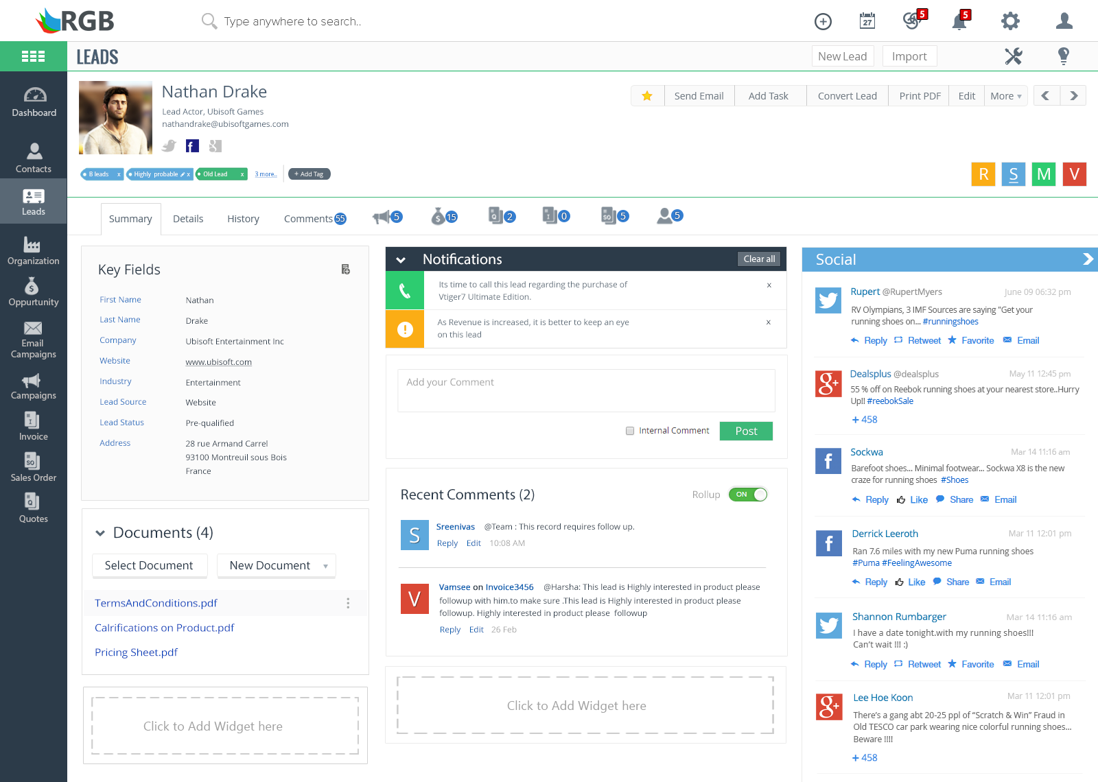
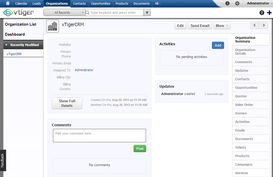
Screenshots
What is the better way of marketing other than showing before and after screenshots?
Before
After
Conclusion
This is one of the screens I designed as part of the major revamp of CRM system (version 7) in 2015. This major overhaul helped the product to evolve into next generation CRM and brought many awards to company. You can checkout the Vtiger website.