Pill reminder app - Casestudy
Tool to help people remember to take medicine on time
Duration
3 months
Role
UX designer
What's the problem?
Many people often forget about the taking the medicines or supplements because older people forget about them and young adults are simply busy. People also lose track of the medicines and when empty, it is difficult for them to get them immediately.
Goal
Provide an app that allows people to create reminders for the medicines and also allows them to keep track of the medicines
Empathize with users
My research goals are:
- To find out the reasons behind the forgetting the pills and the situation that leads to it.
- How people keep tracking their medicines and the consumption log
The interviews questions were:
- How many times you take medicines in a day?
- Did you forget to take medicine? if yes, what is the main reason for it?
- Are you currently using any app that reminds about medicine?
- What are the features you would like to see in the new app?
Research findings
David is a retired lecturer, diagnosed with Idiopathic Parkinson’s who needs to remind him about medicine on time because he forgets taking his medicine.
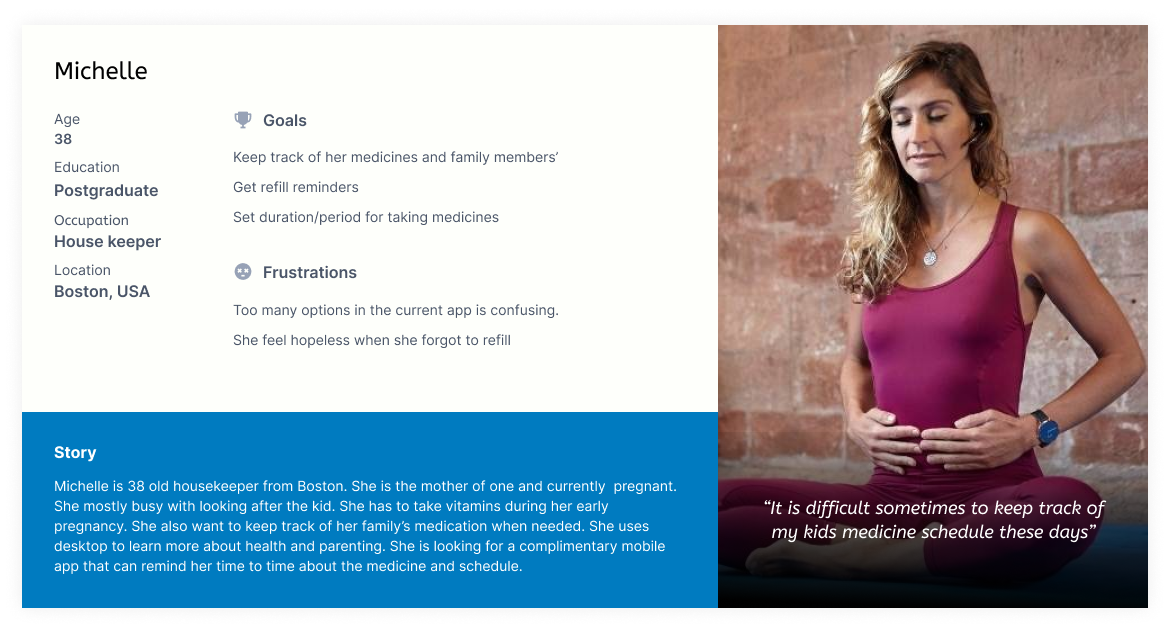
Michelle is a mom of two kids who needs to remind about her kids medicine schedule because does not want her child to skip the medicine .
Ron is a student and fitness freak who needs to keep track of his vitamin pills because he can order well before they are empty.
Keep the log of medicine consumption.
Based on the research the persona are


Define the problem
Problem statement
The new Pill reminder app allows people to get reminders by creating and scheduling for multiple people, track the medicines and keep the history.
Value Propositions
- Provide live alerts and notifications
- Reminders upon empty stock
- Create reminders for multiple people
User stories
The following are the most important userstories that are derived from the research phase
- As a parkinsons patient I want to get reminder for my medicine so that I can take my essential medication on time.
- As a busy mom I want to create a reminder for my kids medication so that I can provide medicine to my children in time.
- As a young adult who uses vitamins I want to get notified when my pills got empty so that I can buy them in advance.
Ideation
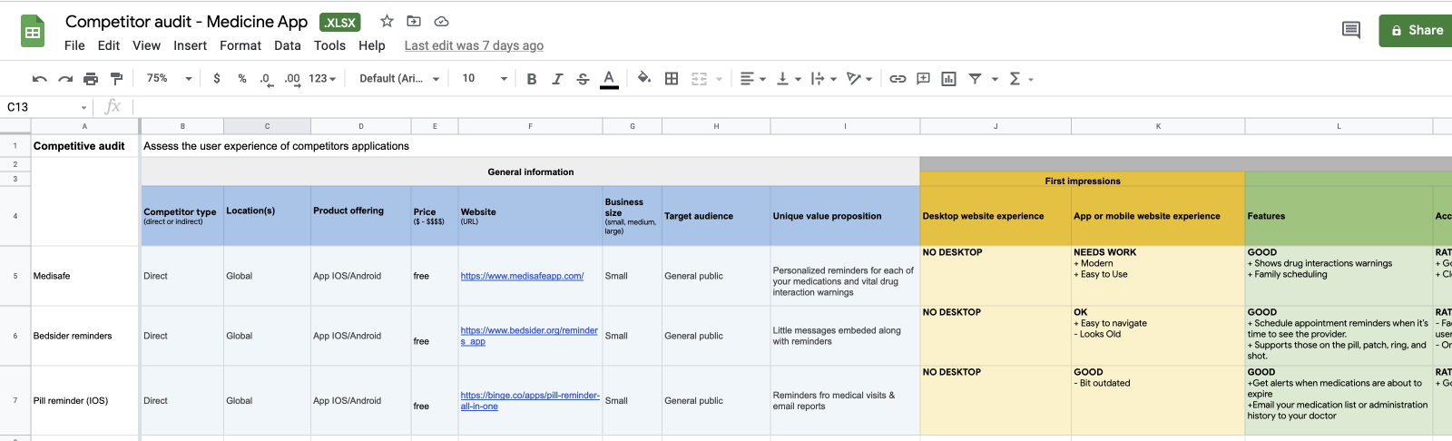
Before starting the work, I always spend some time on researching the similar apps out there to know the strengths, weakness and key selling points.Competitive Audit:
The goal is to figure out how the competitor’ apps accomplishing the similar tasks and what are the other features they are supporting.
Opportunities
- Provide simpler and easy to use UI that requires less training
- Provide live alerts and notifications
- Allow users to create reminders about their loved ones
- Provide a way to notify when a medicine is empty
Its now time to find out the solutions for these problems.
Hypothesis statements
The following are some of the statements using IF - THAN to figure out solutions to the problems above.
- If David provided with an app that creates reminder to take medicine than he should be able to take medicine on time.
- If Michelle provided with an app that can creates reminders about her familiy members' medicine than she can make her childern to take medicine on time.
- If Ron provided with an app that notifies when the medicine run out then he should be able to order the medicine in advance.
Paper sketches
Main focus is to provide the UX for the people to create a reminders without distracting them by adding so many feature and simple information architecture that clearly differentiate between the tasks.

Design - Wireframes
The full schedule of reminders can be seen on homepage in chronological order starting from Today. User can visit this page to plan the medicine according to the schedule.
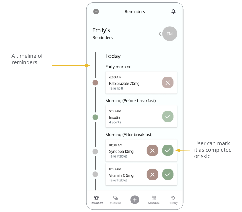
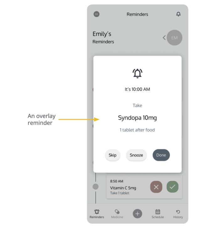
This is a reminder that take full attention form the user so that he will not miss any.
Prototype in Action
User testing
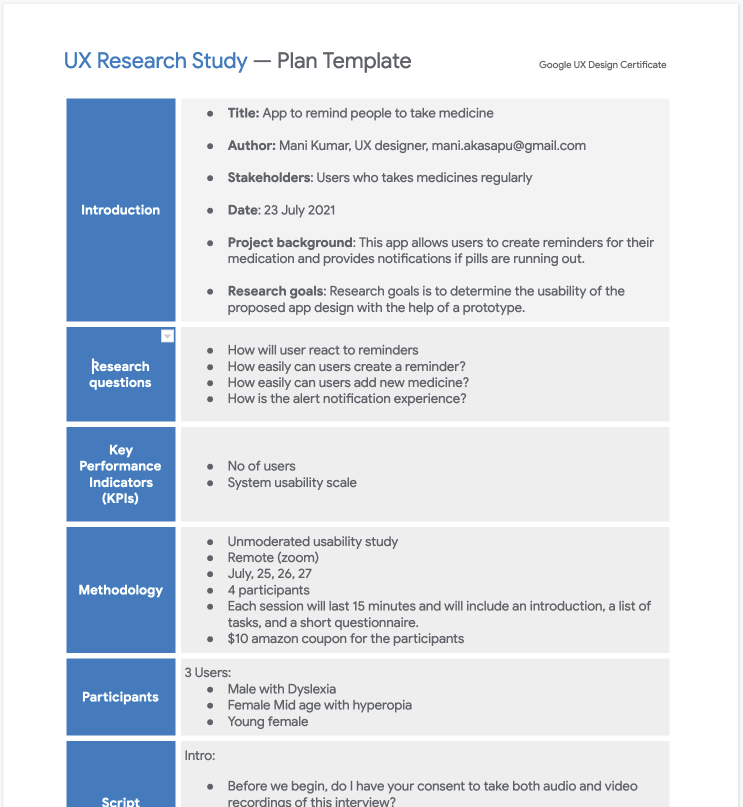
UX Research study
- Study type: Unmoderated study
- No of Participants: 3
- Location: Remote
- Length: 10-15 min
UX Research study plan
As a part of usability study, I prepared a UX study plan and included details such as
research questions, participants, duration, defined methodology & KPIs and prepared testing script.
UX Research study
Usability study is unmoderated so the users were shared their zoom recordings post activitiy. The goal is to find out the user experience of common operations. So, The research questions are based around the following tasks.
- - Create a reminder for medicine on the given date
- - Make the reminder as taken or skip
- - Find out the number of pills left
- - Create reminder for person named Jone doe
- - Open the history and check if a person takes medicine on the given date
UX Research study findings
The feedback and observations received from the research needs to be synthesized. So, the feedback is organized into themes. Whimsical is handy tool for this.
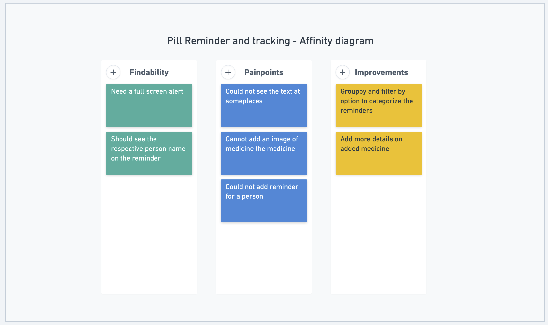
Insights
The following are the insights and recommendations for next iteration
Insight:
Ability to select the person while creating a reminder
Users could not able to find out how to create reminder for different persons
Recommendation:
Improve the visibility of the field.
Insight:
Could not set the alert when medicine is empty
Users could not able to find the checkbox.
Recommendation:
Improve the visibility of the checkbox
Insight:
Could not snooze the reminder.
Users want to snooze the reminder.
Recommendation:
Provide snooze option on the popover.
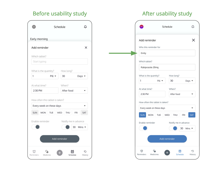
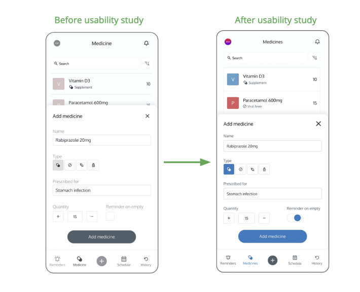
The following is the comparision of the wireframes before and after research.
Option to select the person to whom the reminder is being created.
Reminder on empty checkbox is converted into mobile friendly toggle.
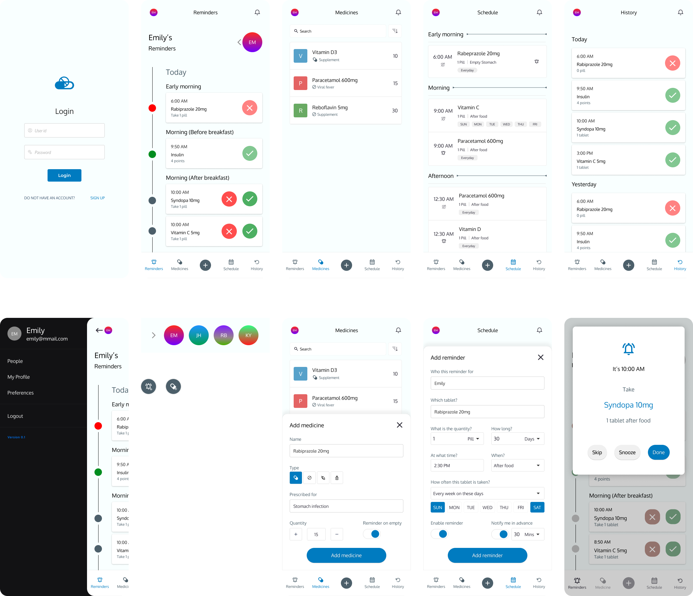
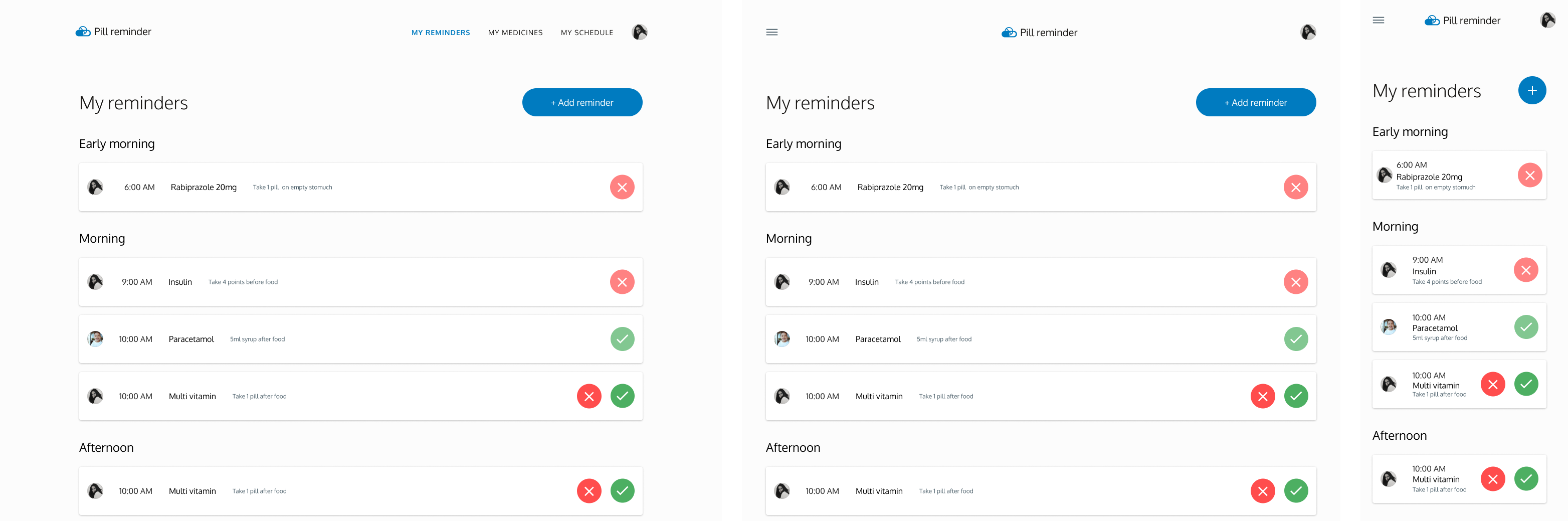
HiFi Design
After several rounds of reviews with my UX friends and some more feedback from forums, I came up with the following mockups.
Mobile
Responsive web
Style guide
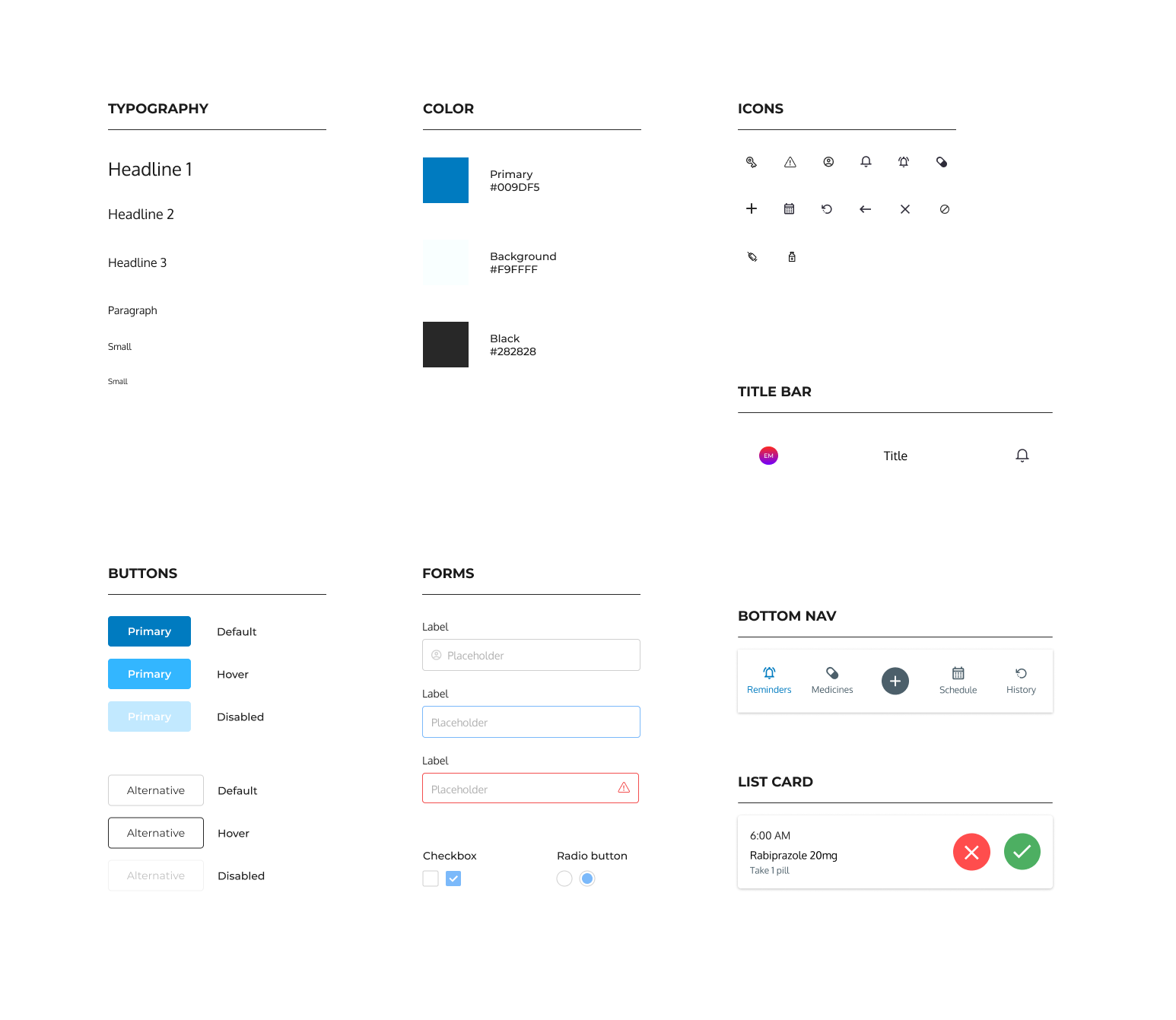
Accessibility Considerations
The app follows the material design guidelines. Additionally the following a11y aspects were considered.
- Contrast ratio adjusted & used high contrast colors for fonts
- Removed flashy elemnts & adjusted animations
- Provided multiple ways to navigate to a page or feature other than gestures
High-fidelity Prototype
Conclusion
The app makes a difference in people lives by making sure they focus on the day to day tasks rather than worrying about medicine schedule. The main takeaway for me is handling continuity and consistency across the devices and making use of device specific features to enhance the experience.