Flower-ordering flow
Revamped flower-ordering website for local florist, that is intuitive and responsive. The aim is make flower-ordering as simple as possible whilst allows customers to schedule the delivery time, address and personalized message.
Challenge
To design a responsive flower-ordering website which helps users to find the flowers that are deliverable to their location, provides easy checkout process and view the status of the order until delivered.
Research
My research goal is to find out how the users order flowers online and the
problems they face during the process.
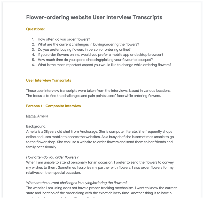
The interviews questions were:
- How often do you order flowers?
- What are the current challenges in buying/ordering the flowers?
- Do you prefer buying flowers in person or ordering online?
- If you order flowers online, would you prefer a mobile app or desktop browser?
- How much time do you spend in choosing/picking your favourite bouquet?
- What is the most important aspect you would like to change while ordering flowers?
The pain points are
Most of the websites are not responsive so the users has to scroll a lot horizontally to reach desired destination
Florist websites deos not provide time to time updates about the order.
Users want to customize the message to be sent to receivers
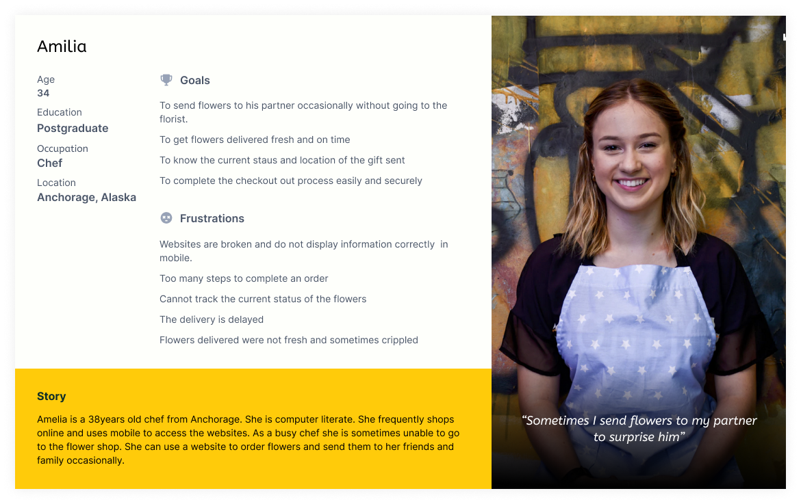
The following is one of the personas based on the interviews.
Define the problem
And the problem statement is:
The new website should help users to find the flowers that are deliverable to their location
and provides easy checkout process which increases the number of online purchases.
We will measure the effectivesness by percentage of increase in online orders.
Value Propositions
- Add option to select the location to be delivered
- Easy to use Filtering system
- Provide simpler single page checkout option
User stories
The following are the most important userstories that are derived from the research phase
- As a customer I want to filter the flowers that are deliverable to me so that I can only see the flowers that are available for my delivery location
- As a customer I want to set the delivery date and time so that my order will be delivered fresh at the right time.
- As a customer I want to customize the delivery message so that my wishes will be conveyed when I send flowers as a gift to someone.
- As a customer I want to track the order so that I know the flowers are are being delivered on right time and location.
- As a customer I want to view the webpage on mobile seamlessly so that I can order the flowers from my mobile.
Ideation
Its now time to find out the solutions for these problems.
Competitive Audit:
The goal is to assess how and what the direct competitors are solving and also find their unique selling point.
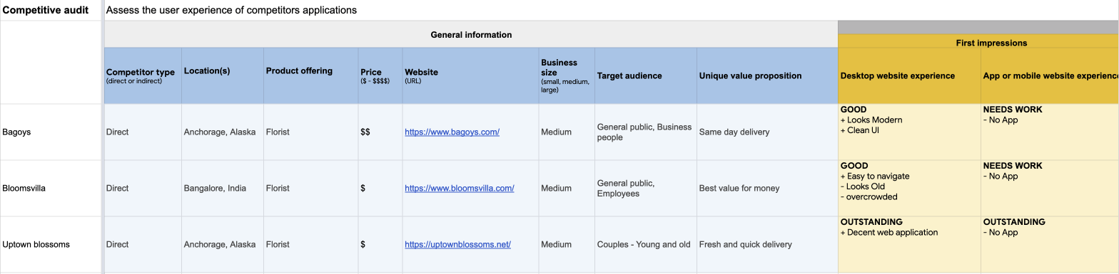
From the analysis, the following are the gaps & opportunities for my new app. You can view full report here.
Gaps
- Two of the websites are not so good at organizing the categories and filters
- Filtering options are not based on the delivery location
- Checkout process is bit lengthy
Opportunities
- Provide simpler and easy to use UI that allows users to find what they need
- Provide location option so that the items that are deliverable to that location only be shown
- Provide simpler filtering options
- Introduce simpler one page checkout option
Hypothesis statements
The following are some of the statements using IF - THAN to figure out solutions to the problems above.
- If customers provided with an page with various filters than they should be able to reduce the number of items to be displayed in the list and quickly select the desired item.
- If customers are provided a with an ability to type the message for receiver while checkout then florists can write them on the card while delivering the order.
- If Customers are provided with a link to tracking in the confirmation page than customers can go to tracking page directly by clicking on that link to track thier order.
- If Customers are provided with a responsive web page than the customers can view the page in thier mobile browser seamlessly.
How might we
The next step is doing an excercise on "How might we" to solve these problems and use "Crazy eight" for generating crazy but innovative ideas :)
- How might we show the items to user that are easy for scanning?
- How might we combine mutiple checkout steps into single and simplify it?
- How might we provide tracking information that is accessible?
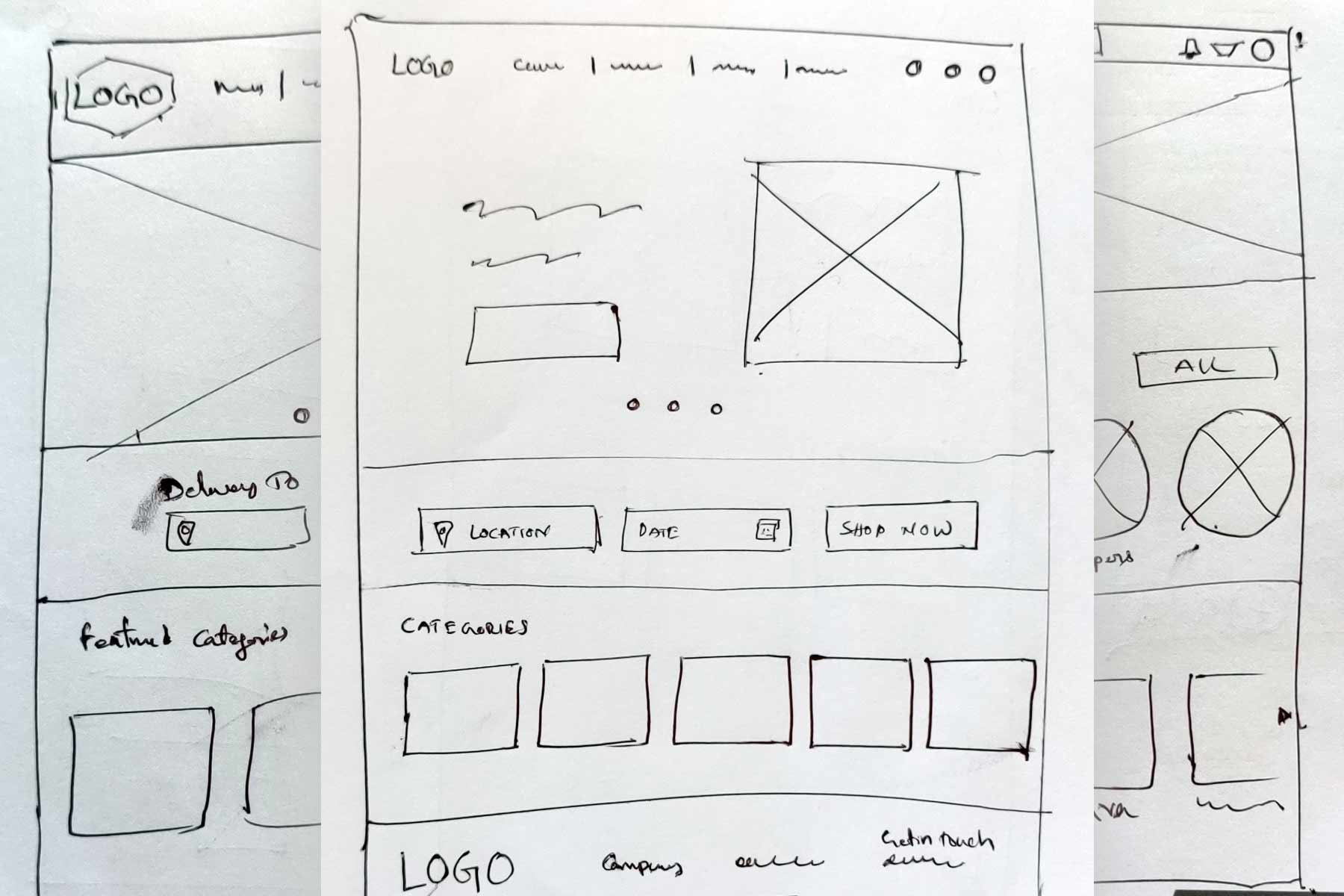
Paper sketches for Home page
As an example, I come up with different versions for home page.
Sitemap
The following is the initial sitemap for website.

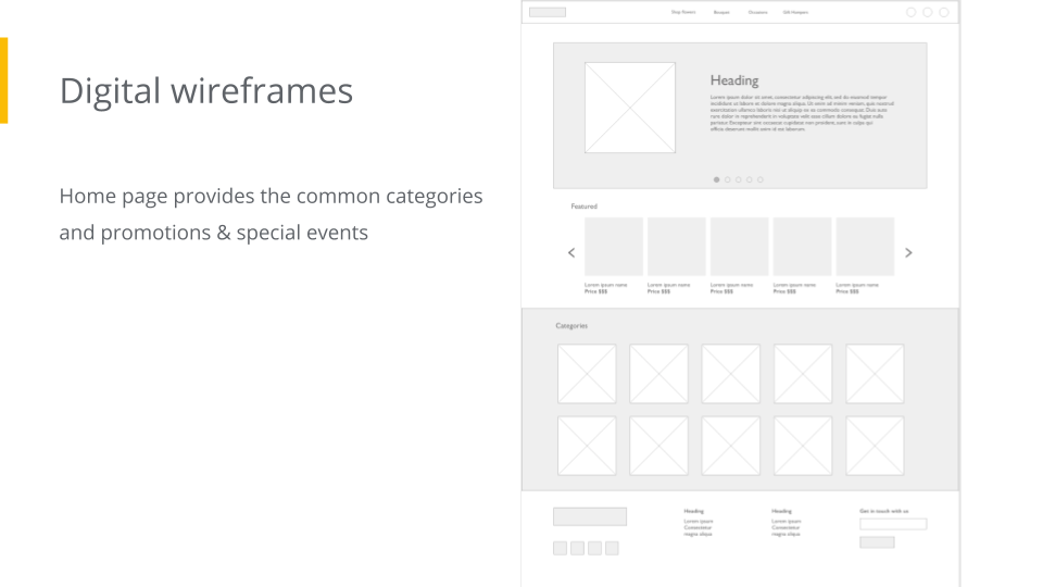
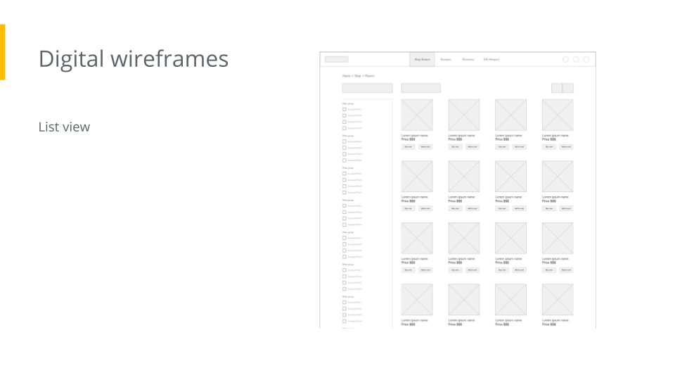
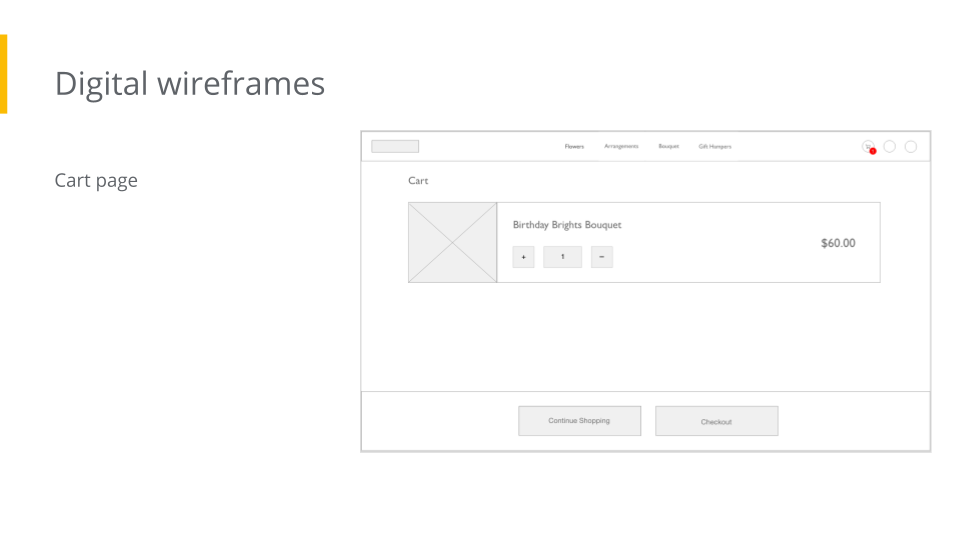
Design
Wireframes
Prototype in Action
User testing
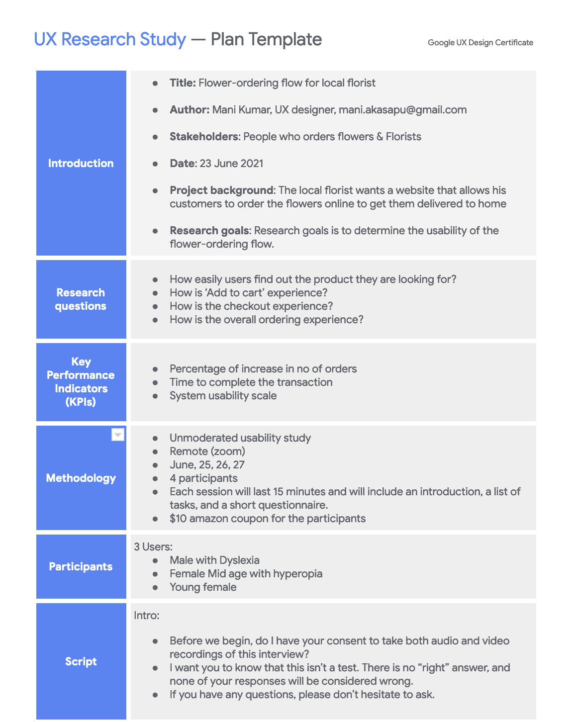
UX Research Study Plan
As a part of usability study, I prepared a UX study plan and included details such as
research questions, participants, duration, defined methodology & KPIs and prepared testing script.
Here you can find the full UX study plan.
UX Research Study
Usability study is unmoderated so users shared their zoom recordings. The goal is to find out the user experience of common inventory management operations. so, The following are the test questions.
- - Prompt 1: Find the Bouquet named “Birthday Brights Bouquet”
- - Prompt 1 - Follow up question: How easy or difficult to find it? Is there anything you would like to change?
- - Prompt 2: Add “Birthday Brights Bouquet” to the cart and go to checkout page
- - Prompt 2 - Follow up question: How easy or difficult to find it? Is there anything you would like to change?
- - Prompt 3: Finish the checkout and get the confirmation
- - Prompt 3 - Follow up question: How was your experience? Is there anything would you like to change?
Insights from Usability study
The following are the insights and recommendations for next iteration
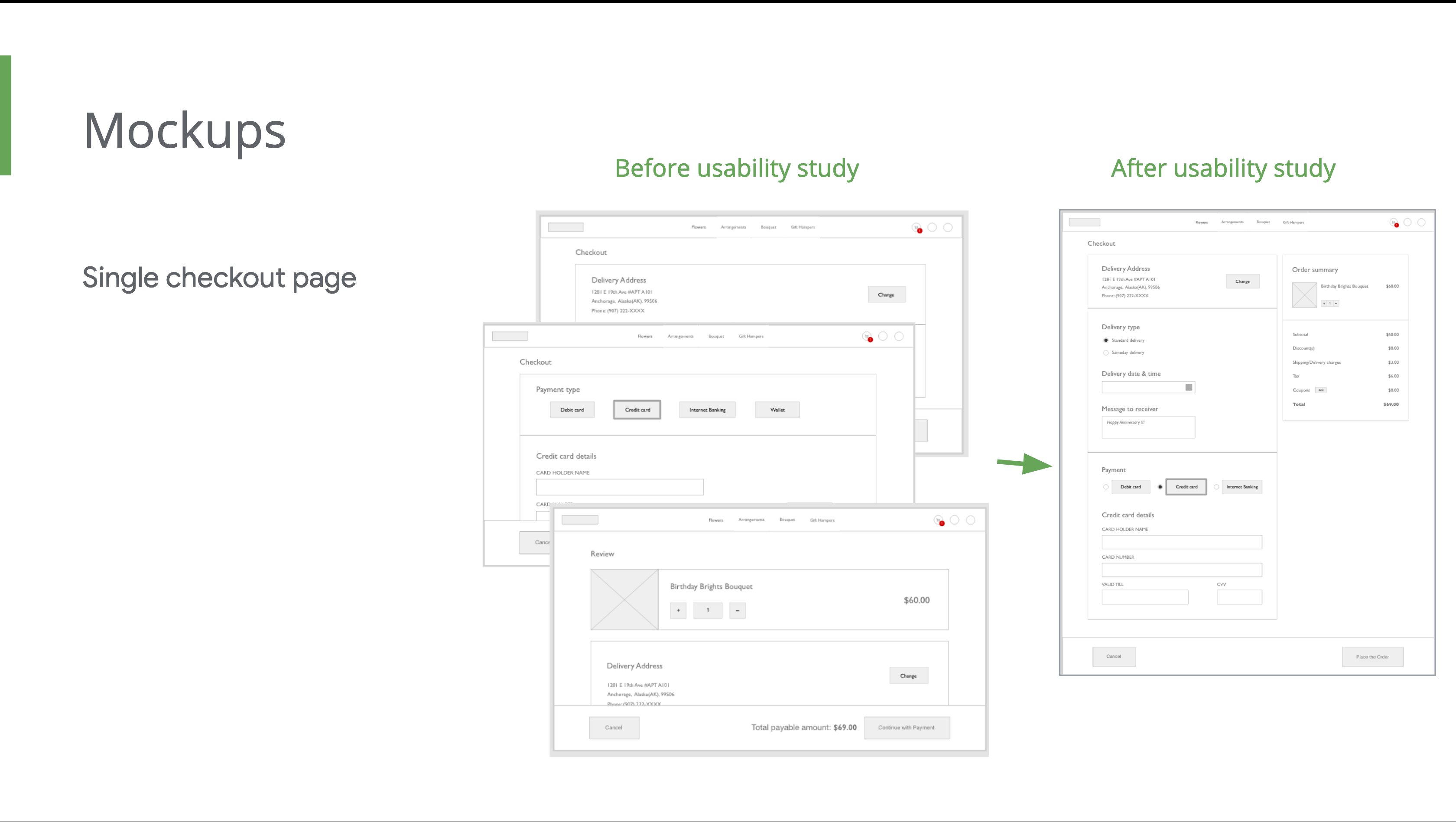
Insight 1:
Too many steps for checkout process
Details:
2 of 3 participants find the checkout process lengthy.
Recommendation:
Reduce the number of steps in checkout page.
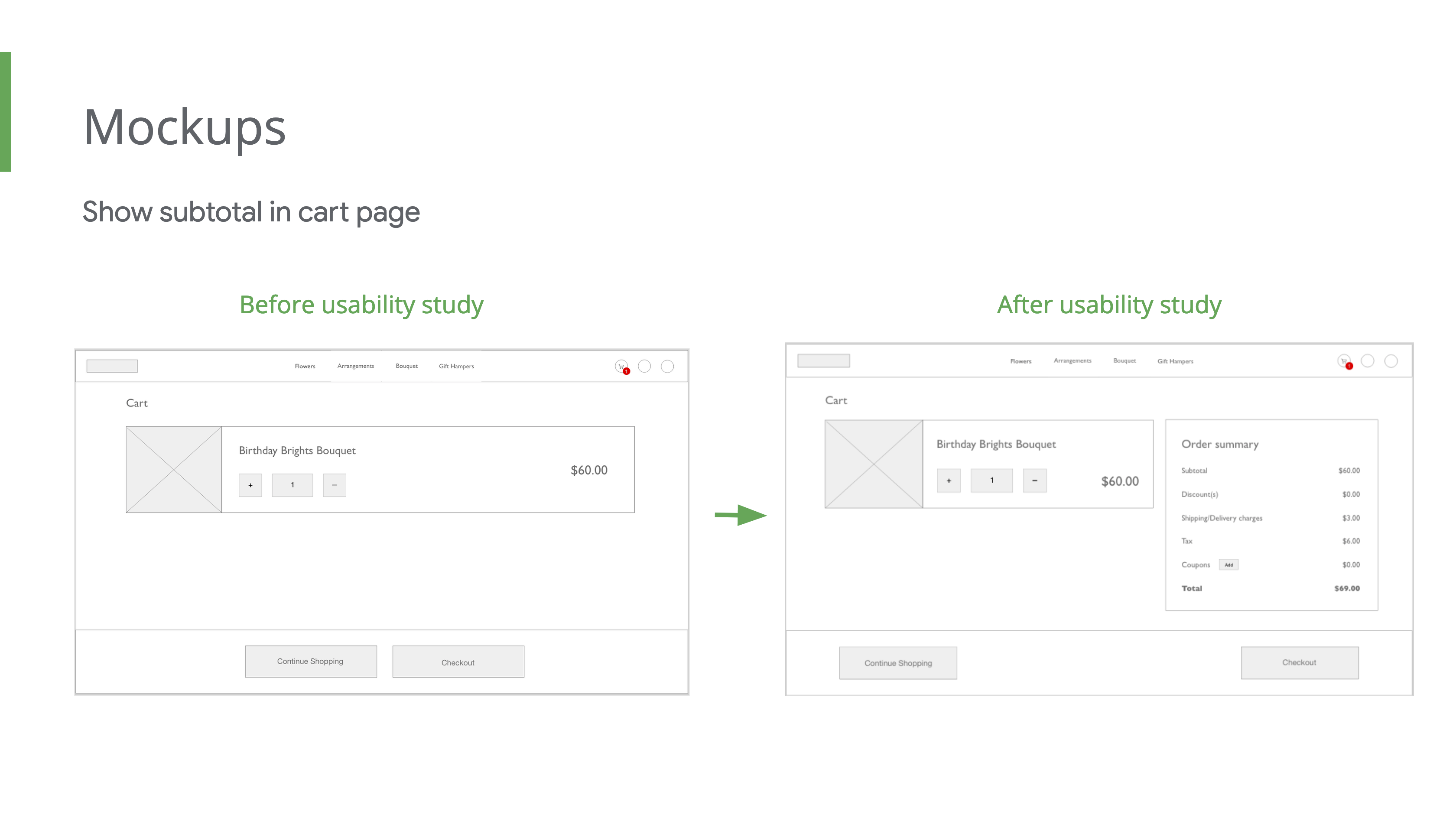
Insight 2:
Users want to see the subtotal of the items added
Details:
3 of 3 participants like to see subtotal of cart items.
Recommendation:
Provide direct option to generate report.
Insight 3:
Users expecting a link to track the order on the confirmation page
Details:
2 of 3 participants want to track the order.
Recommendation:
Provide a link to track the order on the confirmation page.
The following is the comparision of the wireframes before and after research.
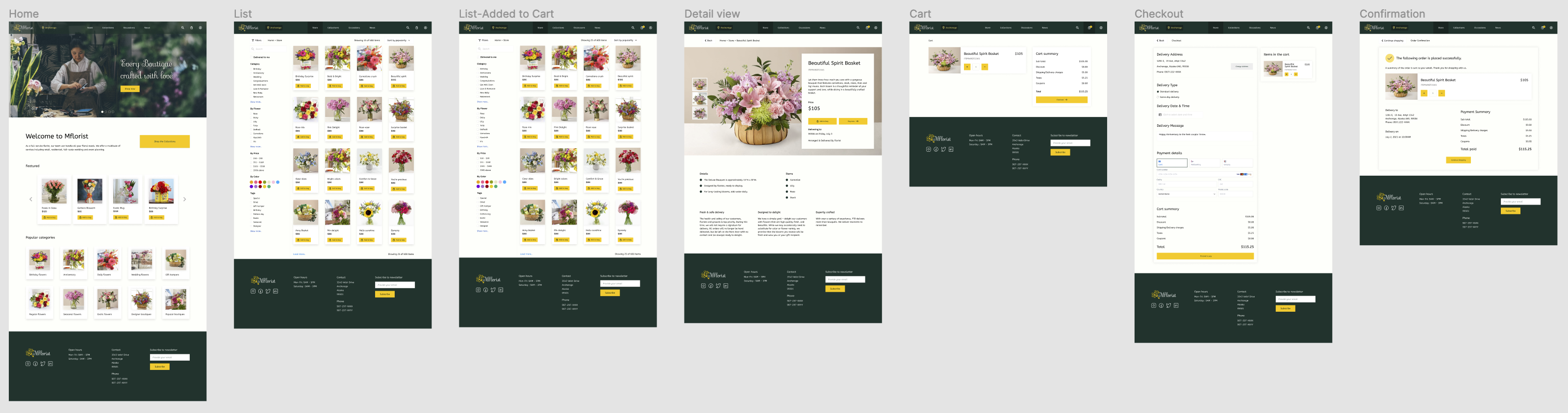
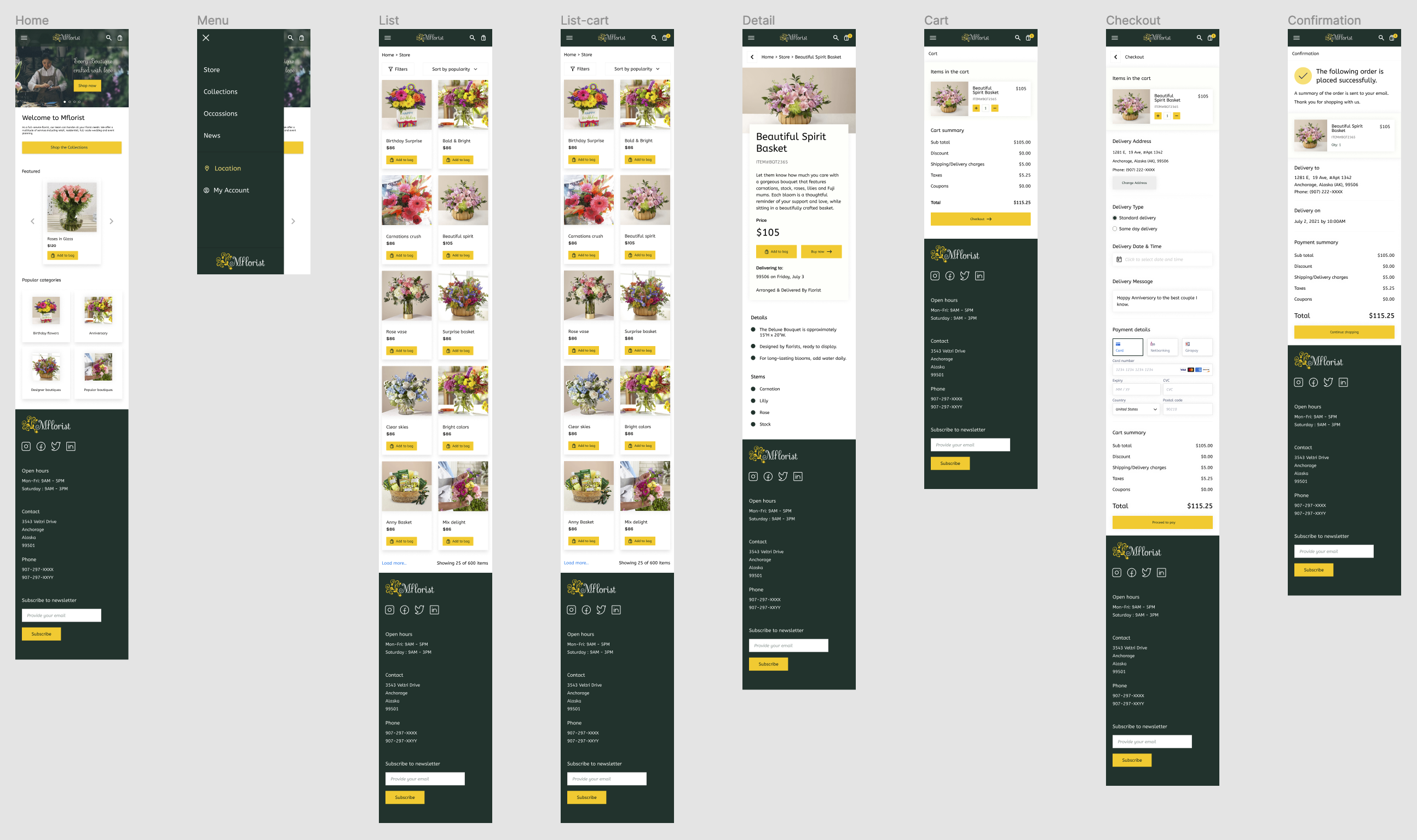
HiFi Design
The following are the responsive design mockups.
Desktop
Mobile browser
Style guide

Accessibility Considerations
The following aspects were considered.
- Contrast ratio adjusted & used high contrast colors for fonts
- Removed too-flashy elements and animations
- Proper heading levels were used
- Simple & easy to understand sitemap structure
High-fidelity Prototype-Desktop
High-fidelity Prototype-Mobile browser
Conclusion
There are a lot of learning opportunities throughout the project. This project provided with an opportunity me to learn about ecommerce, responsive webdesign.